A Tale of Two Interfaces
Oct 23, 2006
Synergy, a mouse and keyboard sharing utility, has proven insanely useful to us users of multiple machines on a single desk. Think of it as a software KVM switch, but minus the "V" (for video.) You can arrange multiple machines side-by-side and Synergy seamlessly moves the mouse pointer and keyboard input from one machine to another at desktop boundaries. It's a great idea and a great tool.
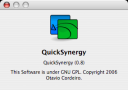
I use QuickSynergy on my PowerBook and Mac Mini, but later happened to look at the official GUI client on my friend's Windows laptop. It's not often that a user interface provokes a blog post on a Monday morning, but this was it.
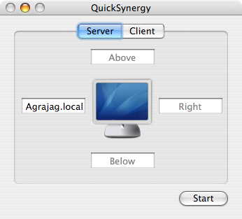
Here are the screenshots:
| QuickSynergy On Mac OS X | Synergy On Windows |
|---|---|
|
|
|


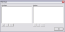


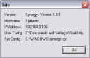
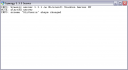
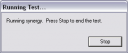
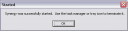
You will notice that QuickSynergy has exactly one dialog box (with two tabs, one to use when running as a server, and another when running as a client) plus one About dialog. Synergy has a total of 9 dialog boxes (plus one About dialog.) The question, I wish, the developers had asked themselves, was whether throwing in a dialog box for every single configurable parameter was the right thing to do. It seems like the UI Designer(s) simply gave up on trying to understand the users' needs, and instead just threw everything out to the user: "here, now there's a dialog box for every single line in the configuration file, go figure it all out." In my opinion, that's the designer shirking his or her responsibility of actually designing.
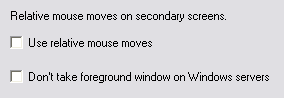 | I wonder how many regular users would ever want to change some of the arcane options. And if there was a savvy user that wanted to, she could just edit the config file! Even as a Computer Science Ph.D. student, I have no idea what the "Relative Mouse Moves" option means, or why I should care about it. (If you say RTFM, that's already the sign of a bad interface.) |
| QuickSynergy On Mac OS X | Synergy On Windows |
|---|---|
 | 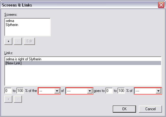 |
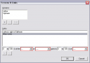
Notice how, in the configuration screen, QuickSynergy simply shows you one screen with four text fields on the four sides, whereas Synergy expects you to enter the positions as "Machine X is to Direction Y of Machine Z." The first way is so much more natural, but guess why the Synergy implements the second way? Because the configuration file is written that way.
These are clearly two very different styles of GUI design (though I would strongly argue that a text field for editing a configuration file does not count as a "GUI", it's simply a command-line interface (CLI) inside a text field.) Quick Synergy puts the user first, and is designed to let the user work naturally with his/her mental model of a keyboard/mouse layout. Synergy starts from the configuration file and slaps on a UI on top of it. Thus, Quick Synergy comes closer to the user, while Synergy stays closer to the machine.
UI Design is not about letting users edit configuration files, it's about letting them do what they started out to do. That a config file needs to be edited to make that happen is a side story.