The Hedonistic Properties of Food
No one can deny that good food makes you happy. For some of us, especially so. But when one refers to "food that's good for you", it turns out invariably to be based upon purely nutritional criteria. Why is the "goodness" of food not evaluated on how much psychological pleasure it brings to the eater?
Of course, taste forms no small part of evaluating food — ask any restaurant critic. But taste varies from palate to palate, and I'm rather referring to the hedonistic properties of food than its culinary properties. Certain foods make me happy, some make me ecstatic, and others make my day. But not all of those foods fall under the category of "food that's good for me". Why not? If a particular food lifts my mood up, gives me pleasure, and enhances my psychological well-being, it should be "good for me", right?
Healthy eating is a relatively recent phenomenon. Not because our forefathers didn't eat healthy. It's because they didn't have to coin a phrase to explicitly tag their diet 'nutritious' — it was always like that: healthy. At the same time, it was also tasty hedonistically-inclined food.
Let's face it, food is much more than just vital life-sustaining organic material being ingested regularly. Food is a central aspect of every culture; in fact, an inseparable part of it. So much so that some cultures are best-known for their food preparation practices, often masking their other, more significant achievements and traditions. Answer this one: how much do you know about Thai culture, other than Pad Thai and Masaman curries? The Szechuan? Malvani? Cajun? Mongolian? Penang?
After such rich culinary traditions, the current century has managed to create a divide between tasty and nutritious — in response to another 21st century phenomenon, the widespread global obesity epidemic. Junk food is nutritionally, well, junk, but it has made a permanent home in some people's lives (and in most cases, in their tummies too.) Obviously, there is something about it that makes people want to eat it. It's no different from an addiction, really. Put in another way, the hedonistic power of food trumps its perceived nutritional value to a significant number of people.
What if they didn't have to choose? What if they could get nutritious with tasty? Obsessed with making every food item extremely nutritious and "good for you", we have, in the process, killed its taste. What if we could backtrack just a little bit, to the point where food used to be tasty as well as nutritious (maybe not as much as current 'health foods', though)? To find this middle ground, perhaps we can look at our past and derive inspiration from some of the older recipes.
After all, we are living, thinking, pleasure-loving human beings who sincerely enjoy our regular excursions to the dining table, not just disinterested ingesters of nutrients.
A Proposal to Integrate Site-Specific Search Boxes into Browser Chrome
Why do I have to search for the search box on any site I visit, before I can type my query into it? Given that almost every well-designed site has a search field, and it has been recommended as a good usability practice since 2001, why is it sometimes hidden deep inside the layout? Here is a suggestion for a change in the browser UI that will enable users to find the search box faster. Even faster than other suggestions so far. It only involves a little semantic markup on part of page authors and some redesign on part of browser makers.
The search box within the browser is underused.
The search box is one of the few basic design patterns omnipresent on the Web. It is also a de facto usability practice to place this search box towards the top right corner of the page. Yet, every site has it at a slightly different location (and some, even towards the bottom.) The user needs to search visually for the search box, or at least glance around until she finds it.
During this entire time, the search box within the browser chrome typically lies unused. It has a default search engine defined where it directs all queries typed into it. Why can't the currently loaded website take advantage of this in-built search field for its own site-restricted search?
How it would work:
When a user is browsing a site that supports this feature, any searches conducted using the browser search box will send the queries to the site in question, and be able to display search results directly. When no site is loaded, the queries are directed to the user's default search engine, just as it is now.
This proposal does not require any significant changes to any markup language -- all that is needed is to enhance the markup with semantic knowledge, and microformats are just the answer! Simply marking up a <form> element with the CSS class "search" should be enough to tell the browser that this is a search form that should be promoted to the browser's search box chrome.
Prior work on similar problems
HTML 3.2 (yes, 3.2) defines a link relationship type for search pages. Adding <a href="/search" rel="search"> indicates that the outgoing link is to a search page. Browsers currently don't do much with this information (please correct me if you are aware of a browser that does something intelligent with this information). OpenSearch is (in their words) a simple format for the sharing of search results. Useful as it is, OpenSearch is more geared towards large-scale general search engines, and browser makers are adopting it as a standard for letting their users pick and install search plugins in browsers.
However, being able to customize the search field on a per-site basis with zero configuration on part of the user is not addressed by any of these proposals.
Addressing Potential Criticism
A few critics might argue that such usage dilutes the purpose of the search field ("It's meant for searching via a search engine, not on a per-site basis") or be concerned about possible user confusion ("Is my query being sent to a search engine or to the site I'm now visiting?").
Considering an intentionality-driven approach to design, this UI is perfectly aligned with the user's intentions. If a page has been rendered in a browser window, the user's intention is likely to search within that site. If the user wanted to perform a search using a search engine, there is always the possibility of loading a new tab and then searching via the same field.
Issues of Mode
This also brings up the question of whether such a UI is inherently mode-based. (Modes in a User Interface are said to exist when a single input can result in two or more possible outcomes, depending upon the state of the UI at that point. It is generally considered bad design to employ modes in a UI because it invariably leads to user confusion.) In this case, it is arguable whether or not this UI employs modes.
The user task is "to search", and the current site can be considered a specialized search engine (the specialization is that they only search within their own site). Given that a lot of sites employ site-limited versions of generalized search engines (e.g. Google's Custom Search Engines), this notion is not very hard to think of. Hence, I argue that these are not two different modes, but two different search providers for the same box, just as current implementations offer users a choice among Google, Yahoo, Altavista and others.
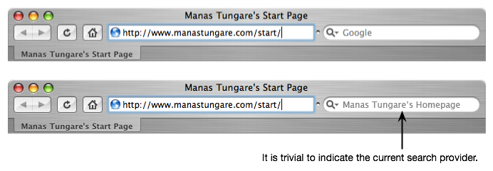
It is also easy to indicate the destination of the search queries in a visually accessible format. Safari (for example) displays the word "Google" in the search field. When a site-search box is displayed in its place, it is trivial to display the name of the site instead of the word "Google". It is also trivial to reuse the favicon for the same purpose.
Why not?
What do you think about this idea? Comments, suggestions, enhancements appreciated!
Virginia Tech Shootout
A terrible piece of news was announced to us this morning while writing a test. An unidentified gunman opened fire on two separate occasions today, killing one person at Ambler Johnston and several more at Norris Hall. The current fatality count stands at 22 — now updated to 32 — this is absolutely, positively horrifying, especially for a rural campus like Virginia Tech.
Two bomb threats, last one two days ago
The campus has been plagued by law-and-order trouble most of last year; we had two bomb threats for buildings on campus, on April 2 and April 13 (just two days before today's shootout!). On both occasions, the respective buildings were immediately evacuated and all events suspended until police could conduct a more thorough inspection of each building. Following the last threat on Friday, the three buildings were closed until Sunday night. The university sent a campus-wide email Sunday evening that those buildings would open at 7:00am Monday and all events scheduled for today would resume.
Second shooting led to more fatalities
So we went off at 9:00am, right after the first shooting. At that time, if we had known about the first incident that occurred at 7:15am, we sure as hell wouldn't have ventured out. We only heard about it later, some time around 9:26am, via email from the University. While we were on the bus to campus, it was probably exactly that time that the killer moved from Ambler Johnston Hall to Norris Hall, where the second shoutout occurred. Most of the fatalities occurred at the second shooting. If that could have been prevented — oh well, hindsight is always 20/20.
First, curfew; then, evacuation
The first email from the University asked us to stay indoors, lock the doors, and away from windows. The second one told us that the campus was being evacuated, and we should leave the building as soon as possible. We left at around 11:30am from Whittemore hall, and a classmate offered to drop us back home. The status of the Blacksburg Transit bus service was not known.
Shock at home
The real shock came when we reached home, because accurate information about the happenings of the morning was not available until after President Steger's statement released at noon. The sheer number of fatalities and injuries — 22 dead, 21 injuries — was mind-boggling. It is expected that the death toll may rise as more information is available.
Is anyone going to do something about this?
Or should we just expect the National Rifle Association to convene at Blacksburg later this month? If you don't know what I'm talking about, please see Michael Moore's documentary, Bowling for Columbine. I've written about this topic before: it's high time someone does something about this.
22 32 innocent lives lost, not to mention all the victims over the years, is reason enough to do something about the root of the problems, the easy availability of guns.
Update:
This blog entry was posted before we learned that Minal Panchal was missing. After we heard, most of us have been on campus or at Montgomery Regional Hospital trying to locate her.
Announcing the Google Calendar Dashboard Widget
In the tradition of writing gadgets for Google Desktop and other Google properties, here's one more from me: the Google Calendar Widget for Mac OS X Dashboard.
A Tale of Two Interfaces
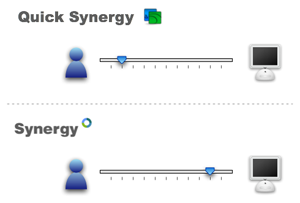
Synergy, a mouse and keyboard sharing utility, has proven insanely useful to us users of multiple machines on a single desk. Think of it as a software KVM switch, but minus the "V" (for video.) You can arrange multiple machines side-by-side and Synergy seamlessly moves the mouse pointer and keyboard input from one machine to another at desktop boundaries. It's a great idea and a great tool.
I use QuickSynergy on my PowerBook and Mac Mini, but later happened to look at the official GUI client on my friend's Windows laptop. It's not often that a user interface provokes a blog post on a Monday morning, but this was it.
Here are the screenshots:
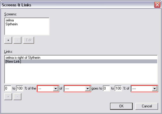
| QuickSynergy On Mac OS X | Synergy On Windows |
|---|---|
|
|
|


You will notice that QuickSynergy has exactly one dialog box (with two tabs, one to use when running as a server, and another when running as a client) plus one About dialog. Synergy has a total of 9 dialog boxes (plus one About dialog.) The question, I wish, the developers had asked themselves, was whether throwing in a dialog box for every single configurable parameter was the right thing to do. It seems like the UI Designer(s) simply gave up on trying to understand the users' needs, and instead just threw everything out to the user: "here, now there's a dialog box for every single line in the configuration file, go figure it all out." In my opinion, that's the designer shirking his or her responsibility of actually designing.
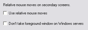 | I wonder how many regular users would ever want to change some of the arcane options. And if there was a savvy user that wanted to, she could just edit the config file! Even as a Computer Science Ph.D. student, I have no idea what the "Relative Mouse Moves" option means, or why I should care about it. (If you say RTFM, that's already the sign of a bad interface.) |
| QuickSynergy On Mac OS X | Synergy On Windows |
|---|---|
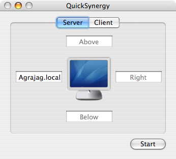 |  |
Notice how, in the configuration screen, QuickSynergy simply shows you one screen with four text fields on the four sides, whereas Synergy expects you to enter the positions as "Machine X is to Direction Y of Machine Z." The first way is so much more natural, but guess why the Synergy implements the second way? Because the configuration file is written that way.
These are clearly two very different styles of GUI design (though I would strongly argue that a text field for editing a configuration file does not count as a "GUI", it's simply a command-line interface (CLI) inside a text field.) Quick Synergy puts the user first, and is designed to let the user work naturally with his/her mental model of a keyboard/mouse layout. Synergy starts from the configuration file and slaps on a UI on top of it. Thus, Quick Synergy comes closer to the user, while Synergy stays closer to the machine.
UI Design is not about letting users edit configuration files, it's about letting them do what they started out to do. That a config file needs to be edited to make that happen is a side story.